Wednesday, October 13, 2010

“Castle”: Season 3, Episode 4. “Punked”

Production Designer: Alfred Sole
Set Decorator: Claire Kaufman

Source: IMDB

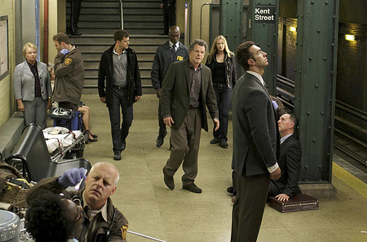
Confession: I haven’t seen that many episodes of “Castle.” What I do know about the series is that it teams a writer, Castle (Nathan Fillion, who is awesome in everything that he’s in), and a cop, Beckett (Stana Katic, whom I have not seen in anything else, but is enjoyable with her wry sense of humor). Their cases have been known to have a whimsical attitude at best and downright fantastical one at worst, mostly due to Castle’s imaginative brainstorming.

A number of the set-ups and settings presented in the show contribute to the overall atmosphere. This week’s unusual locale is an underground steampunk* society. “It’s a subculture that embraces the romance and simplicity of the past and at the same time couples it with the hope and promise and the sheer super-coolness of futuristic design,” Castle explains. Apparently this means that their ideal clubhouse should look like a Victoriana version of a TGIFriday’s. With no tables or chairs.

*A genre of science fiction set in Victorian times when steam was the main source of machine power. Source: dictionary.com

Source: ABC.com

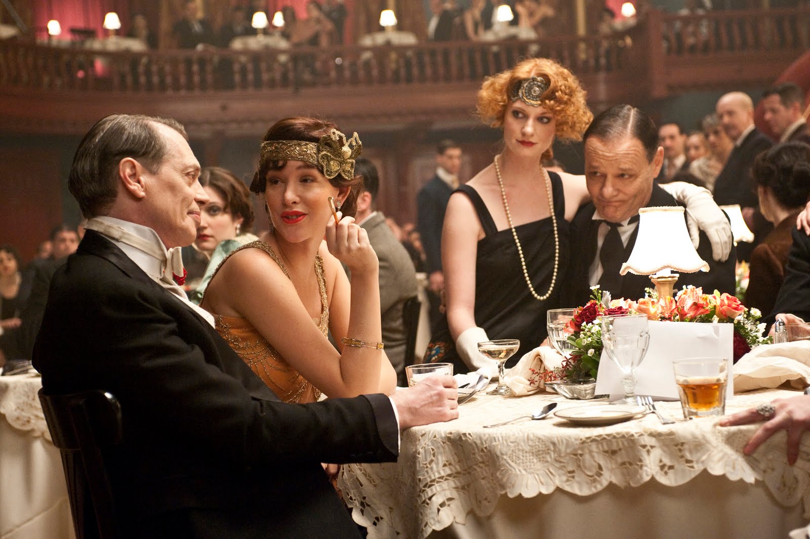
The scenes shown in the Gaslamp League: Private Steampunk Society headquarters make my brain itch quite a bit. The primary reason for this is that I have no idea what is meant to take place in this clubhouse other than to drink, stand around in packed quarters wearing highly dramatic period clothing, and ride around through the masses in steam-operated pennyfarthings that decimate the air quality. Do they hold meetings at all? Discuss literature? Practice the Virginia Reel? Conduct bake sales? 

We know that they like to show off their collections of antique weaponry (a plot point), time machine replicas, glowing Big Ben clocks, and a presentation of the film “A Trip to the Moon” on constant loop. Don’t get me wrong, it’s all very cool stuff. Only this particular set exists only to further the plot in order to partially explain why their victim could die in a turn-of-the-century duel.

Source: ABC.com

In design school one of our projects involved creating an interpretive center based solely on one design movement. At first I had thought that maybe have been the direction taken here. Only the inclusive nature of interpretive centers stands in direct contrast to the barrage of trivia questions Castle and Beckett were accosted with upon their arrival.

I feel that the art department was severely limited here with what they could do, and that the situation possibly was based on time, budget, and/or producer/director input. In response, the fantastic individual pieces were unable to create a cohesive whole. Perhaps this is the nature of temporary sets? Leave your thoughts below!

P.S. If you waited around during my tech issue drama, thanks and welcome back!

Friday, October 8, 2010

Technical Difficulties... Please Stand By

Have plenty of ideas, but a computer that doesn't want to cooperate. It appears to have some sort of virus. Do you think it will respond to NyQuil?


Just a couple of notes regarding shows I've seen this week. Sorry for the lack of links.
  • What a difference lighting makes! Andy's apartment in "Rubicon" which I described as kind of a warm, moody safe haven a week or so ago looks downright chilly in the stark light of day. I love the flexibility of the space as it serves as a metaphor for Will and Andy's deteriorating relationship.
  • The alternate universe on "Fringe" is a masterstroke in terms of accuracy in sets. I used to live in Hoboken, NJ ("Fringe," are you following my life? That wouldn't be creepy or anything.), and it looks absolutely nothing like the one presented on the show. But it's set in an alternate universe so it doesn't need to! The alternate universe seems to have a thing for fluorescent undermount lighting in kitchens, but that's another story for another time. 
I know that I'm kind of new to the game but would love to hear what rooms you'd like to recreate from television or movies. Please feel free to leave selections below in the comments section, and I'll see what I can whip up for you. Ciao!

Monday, October 4, 2010

"Parenthood": L.A. Times L.A. at Home Blog

Set Decorator: Julieann Getman 

I am visiting my family for most of this week. It was part of my brilliant marketing strategy: announce my magnificent set decorating blog to the world and then skip town almost immediately.

How fantastic is it then, that in checking out the Set Decorators Society of America (definitely give it a look sometime, even if just for the impressive slideshow on the home page) website, that I found in their press section a story from the L.A. Times that gives exact details, and not just speculation, for a handful of the major sets from the show? I especially adore the set for Julia's house and how Getman was able to achieve a very expensive look on a budget.

Photo credit: NBC Studios/Universal

The same article has a link to a photo gallery for "Modern Family" and "No Ordinary Family" as well. I confess: I am seriously coveting that level of access. David A. Keeps, please let me know if you need an intern from Boston. Thanks.

Friday, October 1, 2010

"Fringe": Season 3, Episode 2. "The Box"

Production Designers: Ian D. Thomas, Steven J. Jordan
Set Decorators: Beth Kushnick, Louise Roper

Source: IMDB

"Fringe" is set in Boston. It is filmed in Vancouver. There's a challenge.

I don't envy anyone who has to design a set to resemble Boston's Green Line, a subway train that the locals refer to mostly with venom. Some utter confusion, but mostly venom. It's old the oldest in the nation it's slow, and it holds so few passengers that one can tell who's wearing Old Spice and who's not. But to some extent I wish that the version of Kent Street station featured in this episode actually existed.

According to Wikipedia,* Kent Street Station "consists of two staggered side platforms which serve the "C" Branch's two tracks." In order to create dramatic tension and allow Peter Bishop (Joshua Jackson) to save the city, the station had to operate on a single track with a dark and ominous tunnel. Quite frankly, I hate it when I'm waiting on an island platform and the train that arrives first is always running in the opposite direction from which I want to go, but I sense I'm not alone in that. That same entry also states that the station is not wheelchair accessible, so the elevator is inaccurate (if that's where the exit where the up and down arrows leads to), but desperately needed.

Oh, and one other little detail: the real Kent Street station is an OUTDOOR platform, which Wikipedia managed to leave out. Stupid Wikipedia. (Side note, I finally looked up the map and realized that Kent Street is where my former doctor's office is located.) Well, that doesn't work for these purposes at all. Time for some studio magic!

*I know that Wikipedia is not always the most reliable source but I can't imagine anyone being bored enough to mess with this.

Seriously, a pay phone? And an extra is using it? I find I am a bit indcredulous.

IT'S GOT AN ARRIVAL ANNOUNCEMENT LIGHT BOARD!  My apologies to public transportation designers who actually know the technical term for that. Okay, it's probably just a lit up timepiece, but still. I've visited Washington DC several times and have gotten envious at their ability to predict the arrival of the next train. Unfortunately the Green Line is so far from automated that without a universal renovation something this practical seems so highly unlikely. That doesn't stop me/us from wanting it.


Wait, where did the pay phone go? Behind the wall, I know, but it looks like a clever trick.
Spitting image items include the grimy subway tile, the green I-beams, signage, and the overall look and structure of the platform. (Note: I am speaking in terms of the Green Line in general, since the whole "outside platform" thing renders my whole discussion moot) In cases like this, having the big picture match up is much more important than the little pieces. After all, the set is the backdrop on which the characters are meant to sell the story.

Any other Bostonians want to chime in? What's wrong here? What's right here? Other than the obvious of course.

Thursday, September 30, 2010

"How I Met Your Mother": Season 6, Episode 2. "Cleaning House"

Production Designer: Steve Olson
Set Decorator: Susan Mina Eschelbach

Source: IMDB


Not all that long ago* I wrote an entry regarding how to recreate Glenn's (Jennifer Aniston) office set in "Cougar Town". After scouring the internet to find the chest of drawers upon which sat 5 vases and a Buddha (I think it's a Buddha, no time to research), I recommended a Moorish chest from Wisteria that was of the same genus but not the species so to speak. Here it is again to jog your memory:

Source: ABC

Now that I am paying close attention to all of the individual pieces that go into a set I've discovered my first instance of an item resurfacing. This week's "How I Met Your Mother" took the cast to the house of Sam Gibbs (Ben Vereen). Check out what's hiding there in the back:

Source: CBS
Either Glenn and Sam shop at the same store or that chest is a popular rental with set decorators for me to notice it twice in the same week. I'd still love to find out who its initial designer/retailer was, and to know more about its authenticity. As I'm in Boston instead of Los Angeles, I doubt I'll get my answer any time soon.

Lastly,  if I were to know ahead of time that I'd be seeing that chest again, I'd like to give it a nickname so I can play my own version of "Where's Waldo?" Right now, all I can think of is "Chesty McChest," and that isn't quite cutting it.

*It really can't be that long ago. I've only written 6 entries including this one.

Wednesday, September 29, 2010

"Chuck": Season 4, Episode 2. "Chuck Versus the Suitcase"

Production Designer: Cece Destefano
Set Decorator: William DeBiasio
Set Decoration Buyer: Kami Lamprade

Source: IMDB

"I see Sophia stays in the Presidential Suite." So says international spy Chuck Bartowski (Zachary Levi) as he and this partner Sarah Walker (Yvonne Strahovski) are tracking a supermodel (the aforementioned Sophia, Karolina Kurkova) in Milan during Fashion Week who is suspected in the arms trading of "superbullets." Wow. "Chuck" plots are fun and goofy when you watch them onscreen, but they sound downright ridiculous on paper. I wish I could have been a fly on the wall during the table read at the moment in the script where Sophia fights Chuck and Sarah while naked. Yes, you read that right.

Well the Presidential Suite is full of goodies, and not just those superbullets. The lamps alone might take me a bit of time to track down. Yep, it's time to play copycat again so I can tell you where to find key elements of the set to help make your home look just as hip.

Stills from NBC

Lighting first. I love how the production team has layered the lamps in here. It makes a moody and auspicious nighttime scene even more so since the majority of the lighting is on and it's still really dark in there. (See: curtain selection below) Below is a selection of facsimiles for you to steal. Well, buy really. There's a Buy More joke in there somewhere but I'd hate to inflict that upon you.


1. Ashanti Orange Table Lamp from LiteSource/Lamps USA. The base is an excellent match, but the shade should be switched out for something white and ovular oval-shaped. I don't think "ovular" is a word. If it's not, it should be.

2. Glass Lamp with Satin Nickel from Target. Home Goods carries this style like crazy as well.

3. Jayne Artichoke Green Ceramic Table Lamp from Lamps Plus. This unique take on the genie-bottle style base gives it added depth.

4. Twine Floor Lamp from CB2. Perfect, perfect, perfect.

5. Lights Up! Devo Table Lamp with Square Base from Design Public. The shade may be larger than the one shown on this set, but I actually prefer it that way. Gives it a funkier edge.

6. Energy Efficient White Fabric 20 ¼” Ceiling Light from Lamps Plus. Classic yet modern, and not fussy. Though I think there may have been a missed opportunity to find a flush mount that was more chic and still not distracting. Perhaps like this Possini European Floral Flush Mount.

The furniture and window treatments were more of a challenge, but I relish a challenge. Here we go:


1. Worth King-Size Platform Bed and 2 Nightstands from Overstock.com. Zen styling in a wenge finish. The nightstands appear to be easy to bolt down which would be very attractive to a hotel buyer. Also available in queen size.

2. Studio Standard Squares Grommet-Top Panel Drapes from JC Penney. JC Penney's curtains never cease to amaze me, as a good deal of their collection is both stylish and affordable (I have found some to be god-awful; however, still amazed overall). I have them in both my dining and living rooms and my guests are drawn to them when they visit. Also, woot to the huge color selection, and drat for making my job more difficult. I believe the color used here is called "Brushwood Multi" but it's impossible to tell 100% with all of that mood lighting.

3. LACK Wall Shelf from IKEA. So enjoyable to look at. So versatile. Holds everything from books to wine.

4. White Leather Sofa from AtHomeUSA. Sleek, white, leather, tufted. Bonus futon action.

5. Small Round Side Table from Etsy. Good news? Perfect match and cool 1960s vibe. Bad news? Only one left in stock which stinks since the suite uses several. Second option is the Swank C Table from CB2.

6. Yield White Vinyl Swivel Chair from Target. This choice is a little off the beaten path, but I can imagine Chuck and Morgan swiveling back and forth while trying to look like cool spies with straight faces. And that makes me laugh.

7. Bliss Living Home Gemini Red Pillow from LinensNThings. So remember when LinensNThings was having serious financial problems not too far back? Well the company has come a looooong way since then and I was absolutely blown away by their decorative pillow collection. Can't speak for the rest of their products, just the pillows. But oh, what lovely pillows.

Side note: If this were a real hotel suite, I would say that most of the materials and finishes would not adhere to US fire codes and commercial grade durability standards, particularly since I'm quite certain I found the exact source for the curtains. But this is supposed to be in Italy, so I think I'll give it a pass.

So there you have it. I have done your spy research for you prior to your important mission. Reporting from The Castle, this is Diana the Design Diva wishing you happy shopping!

Tuesday, September 28, 2010

"Boardwalk Empire": Season 1, Episode 1. "Pilot"

Production Design: Bob Shaw
Art Direction: Doug Huszti
Set Decorator: Debra Schutt

I have no rationale behind including this poster here. I just really like it.

The aspect of production design that I find fascinating is working with period pieces. The research involved is incredibly time consuming, and in the case of "Boardwalk Empire" required the authentic recreation of not only several interiors, but the entire boardwalk of Atlantic City in1920. Based a behind the scenes video, the boardwalk entailed 300 feet of construction of completely life-like sets and the rest of its eight miles were filled in by the visual effects team. The clip below shows the construction of that set as streaming video, and it's absolutely captivating:


The trick to set design is that you can't just take a look at the year and design around it. If you were to look at a bunch of Art Deco skyscrapers in Atlantic City it would ring ever so slightly false. Instead most of the buildings and scenery were built in the Victorian era with a Beaux-Arts influence. According to Director Martin Scorsese, "There are hardly any remnants of Atlantic City now, the original one. We were guided by photographs of the period, postcards."

Victorian interior architecture/design is showcased heavily on the set of Babette's nightclub, the site of one of the opening scenes. It is evidenced by the dark, Gothic revival wood paneling, the moody green paint, the thick turned balustrade (save for one which I'll get to in a bit), the Battenburg lace tablecloths, etc. As the first scene in that club depicts a "funeral" (a joke regarding the beginning of Prohibition) I found the setting to be cheekily appropriate.

Nucky (Steve Buscemi) and Lucy (Paz De La Huerta) in "Boardwalk Empire"


I'll admit that part of the set (in terms of the "architectural history" of the building within the confines of the story) seems to have been tacked on after its original construction, and that's the balcony. Production Designer Bob Shaw has stated that "There was a real Babette's, and the bar was shaped like a boat."

A still of the balcony level of said boat is shown below, and as far as architectural detail is concerned, I'm quite frankly stumped. I have never seen a balusters in that shape before, and it feels a bit Disney-esque. However, knowing the level of research that went into this production there is certainly a justification for the way this part of the nightclub was presented.


So, I haven't watched episode 2 yet, but I am really looking forward to it. A lot of critics are comparing "Boardwalk" with another HBO juggernaut "The Sopranos". Story- and character-wise, this is a very apt comparison. For me, "Boardwalk" wins hands-down for its extreme attention to visual detail.